

Designing for Care on the Move
Mobile-first learning for real-world conditions - online or offline.
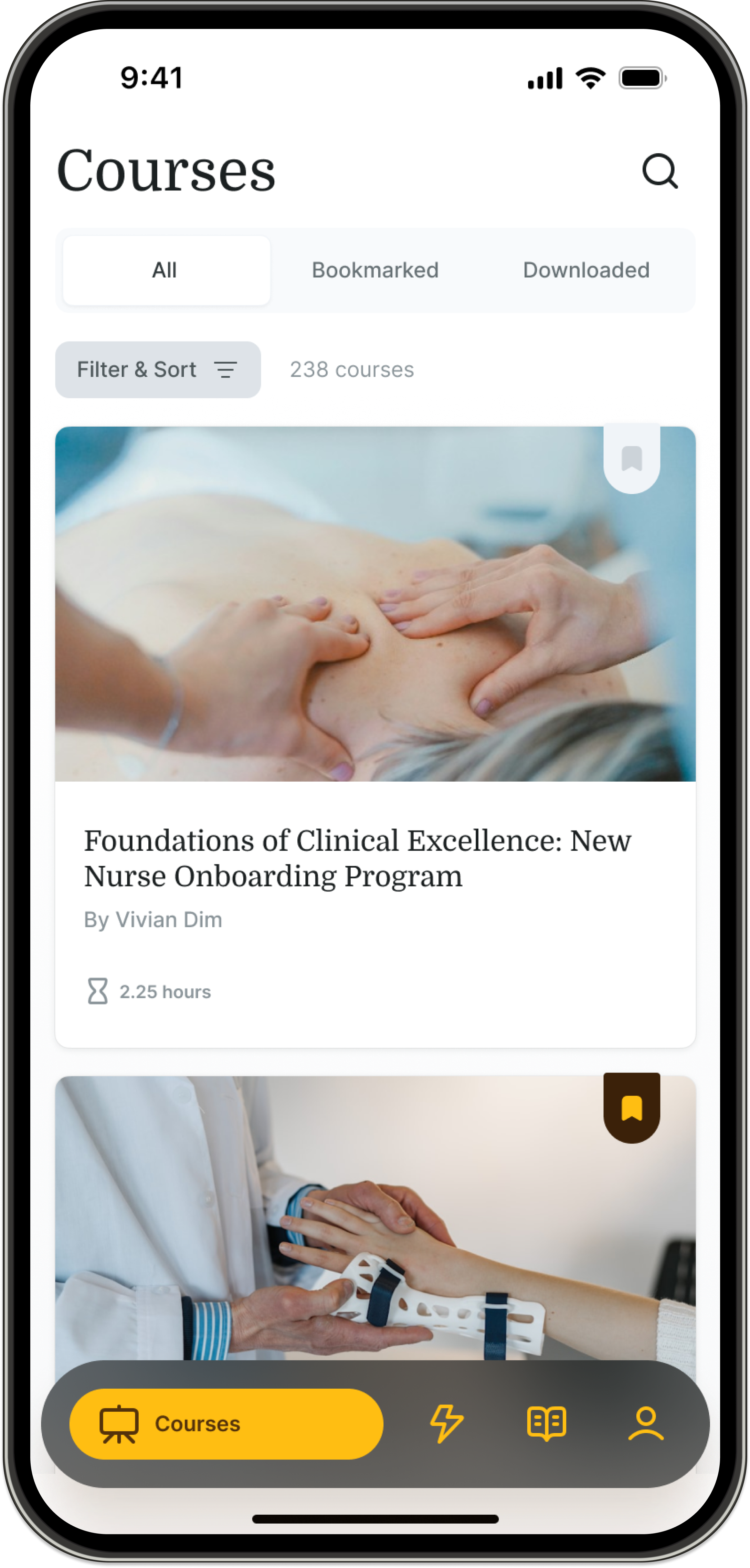
Overview
I led the design of a mobile-first clinician learning experience - translating a complex web platform into an intuitive system built for real-world use.
Designed for clinicians constantly on the move, the experience supports seamless learning across interruptions, limited connectivity, and time constraints.
Reimagined learning as continuous, not session-based
Introduced offline-first capabilities
Built a scalable mobile foundation across iOS and Android
Designed natively for IPad and Tablets
Users
Clinicians don’t always sit down to learn - they fit it into the margins of their day.
Primary: Clinicians (PTs, OTs, Nurses)
Secondary: Healthcare organizations
Tension: Learning was designed for desktop - but happens in motion.
Business Context
This work directly impacted a core engagement and growth channel.
Drives subscription adoption
Improves engagement & retention
Supports clinical outcomes
Expands mobile as a primary platform
The problem
Web engagement dropped as learning shifted into real-world, mobile contexts, where connectivity, interruptions, and time constraints weren’t supported.
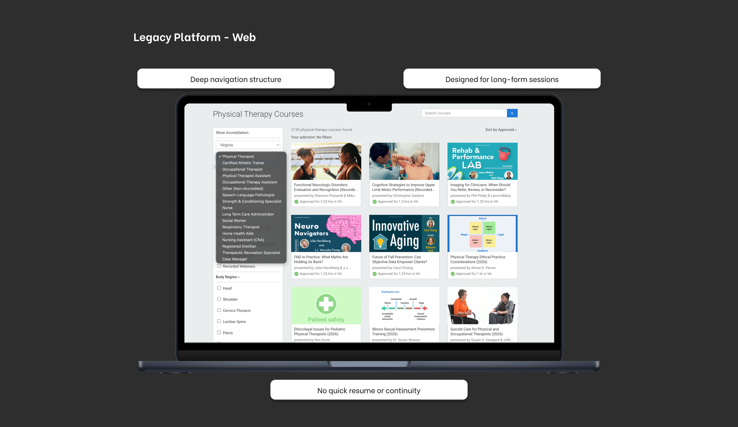
This made it clear that improving the web experience wasn’t enough, we needed a mobile-first system designed for continuity, offline access, and on-the-go usage.
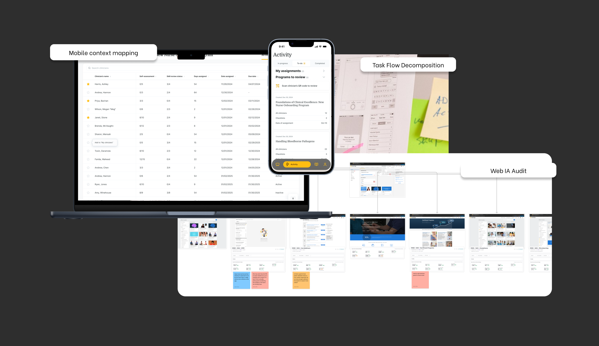
How I translated Web to Mobile
Behavior Analysis
Identified high-value actions vs. ignored areas
→ Prioritized what mattered most on mobile
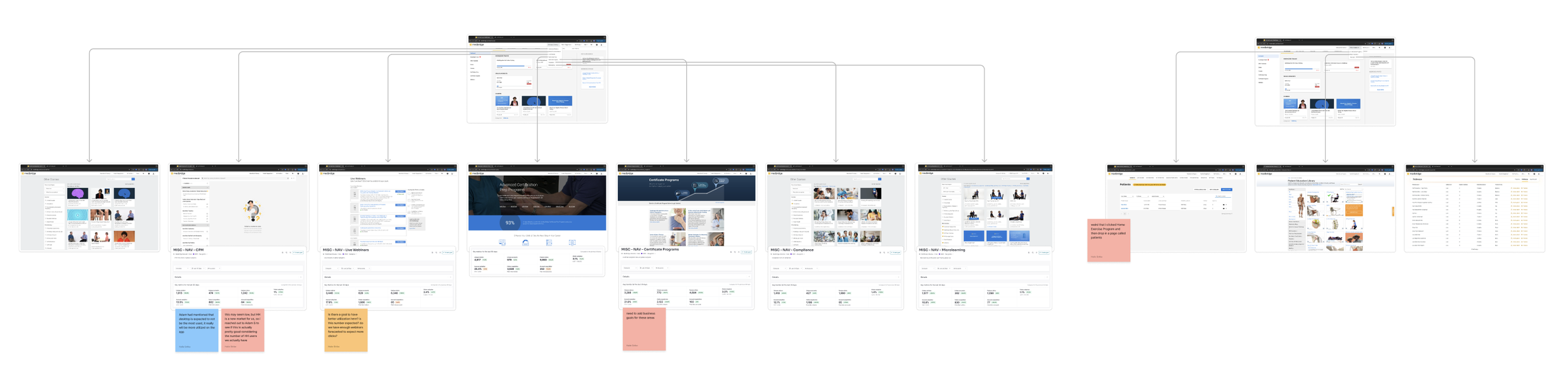
IA Audit
Uncovered deep navigation and hidden actions
→ Simplified access to core flows
Flow Decomposition
Reduced steps in key journeys
→ Removed friction from critical tasks
Insights
Behavioral data, IA audits, and usability testing revealed consistent breakdowns in continuity and navigation.
Learning happens in short, fragmented sessions
Users struggled to resume after interruptions
Navigation buried key actions
Lack of progress visibility reduced motivation
The issue wasn’t lack of motivation - it was friction in the experience.
Every decision prioritized reducing friction and supporting continuity.
Designed hybrid navigation for scale
Prioritized offline-first access
Enabled seamless resume across sessions
Made progress a core motivator
Key Design Decisions
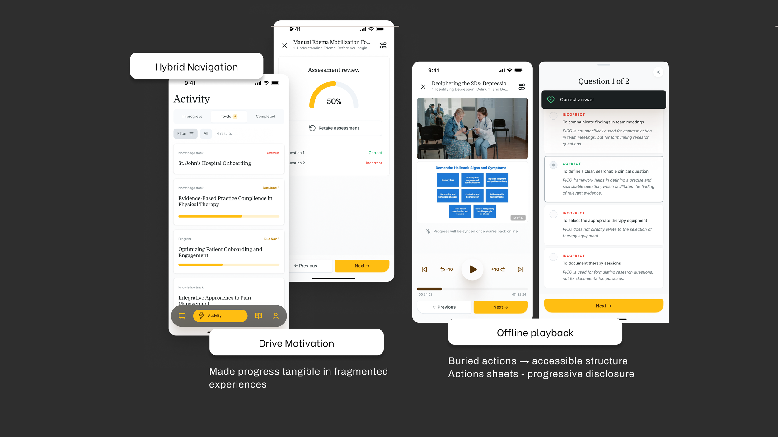
I defined a flexible system that supports real-world behavior:
Hybrid navigation (tabs + hierarchy)
Seamless offline/online continuity
Audio + background playback
Persistent progress tracking
System Design
Trade-offs
We made deliberate trade-offs to prioritize usability and speed to value.
Deferred offline quizzes → reduce complexity
Prioritized audio flexibility → over richer video
Focused on core flows → avoid feature bloat
Accepted delayed sync → preserve continuity
Solution
A flexible, intuitive mobile experience aligned with real-world behavior.
Simplified navigation to key actions
Enabled offline downloads and playback
Supported background and audio-first usage
Made progress visible and motivating
Delivery
Delivered through tight collaboration and system-level execution.
Partnered closely with product and engineering
Defined edge cases (offline, interruptions, sync)
Built and scaled the mobile design system
Supported implementation and QA
Impact
The redesign improved both user experience and business performance.
01
+22% course completion rate → supporting retention and subscription value
02
+18% increase in monthly active users → driving platform adoption
03
Offline usage adopted by 30% of mobile users → expanding reach in low-connectivity environments

Future + Reflection
This foundation unlocks more adaptive learning experiences.
Personalized recommendations
Smarter syncing across devices
AI-assisted learning
Mobile design isn’t about shrinking interfaces—it’s about designing for context.
Simplicity comes from intentional trade-offs
Continuity matters more than feature depth
Systems thinking drives meaningful outcomes
Designing for real-world complexity isn’t about removing it—it’s about orchestrating it.
Want to discuss the design decisions behind this work?
ℹ️ This case study emphasizes design thinking and decision-making. Details have been intentionally generalized to respect confidentiality and intellectual property agreements.