
User Management Architecting
Systems-level redesign of enterprise healthcare workflows that reduced admin friction and support dependency
Role
Lead Product Designer • Initiative Owner
Scope
End-to-end product strategy, UX, UI, prototyping, validation
Overview
I led the redesign of a user-management experience within a healthcare platform, focused on helping administrators manage access, roles, and permissions with greater clarity and confidence.
Rather than optimizing individual screens, I treated this as a systems design problem, structuring workflows in a way that reduced cognitive load while generating clearer operational signals for the broader platform.
Context & Business Framing
As the platform evolved, administrative workflows became increasingly fragmented across navigation, data models, and legacy patterns.
This created friction for organization admins managing users at scale and increased operational dependency on support teams.
From a business perspective, the opportunity was not speed alone - it was improving administrative autonomy, data trust, and scalability.

The Problem
The People Page served as the central hub for managing users, roles, and organizational data - but administrators struggled to complete core tasks efficiently.
This resulted in:
High support dependency for basic actions
Inefficient workflows for managing users at scale
Inconsistent data across systems
Limited visibility into system state and user status
North Star
Create a single, efficient command center that enables administrators to manage users autonomously and at scale.
Design Intent
I anchored the work around three priorities:
Clarity over compression
Reduce cognitive load while maintaining visibility into critical system states.Intent-driven workflows
Structure the experience around administrator tasks, not internal system logic.Scalable patterns
Design systems that support large organizations without introducing new friction.
These priorities required tradeoffs — particularly between flexibility and guidance, and between efficiency and risk.
Design Overview: Prototype Demonstration
This prototype highlights core shifts in workflow, including reduced context switching and streamlined user management tasks.
Design Discovery
Before designing, I focused on understanding where operational friction was occurring.
Research inputs
Expert heuristic audit
Workflow and IA analysis
Support ticket review
Stakeholder interviews
Pendo analytics and qualitative insights
Competitive analysis
This revealed that friction stemmed less from feature gaps and more from fragmented workflows, unclear hierarchy, and inconsistent system logic.
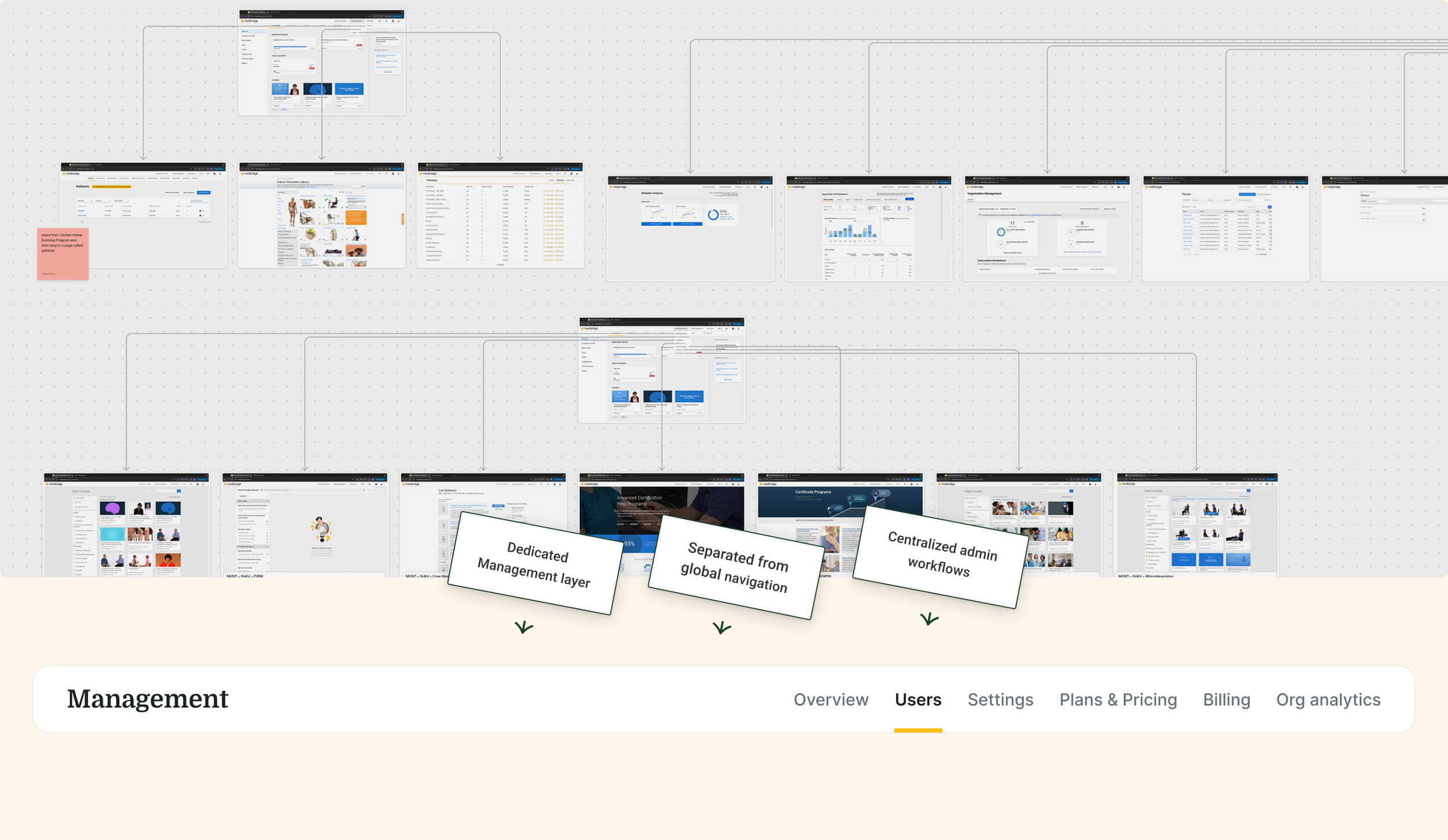
Restructuring the System Architecture
The deeper issue wasn’t just the People page — it was how the platform was organized.
Admin workflows were scattered across global navigation, forcing context switching and increasing cognitive load for high-frequency tasks. I ran an IA audit and mapped core workflows end-to-end, which exposed a structural gap: there was no dedicated space for administrative work.
In partnership with engineering, I introduced a Management layer - a centralized command center for org admins.
This:
Consolidated high-frequency workflows in one place
Reduced cross-page navigation and system noise
Improved focus for admin tasks
Created a scalable foundation for future features
This was a structural shift — aligning the system with how admins actually work.
Key Design Decisions
With the system structure clarified, I focused on a set of design decisions to improve scalability, data integrity, and workflow efficiency within this new foundation.
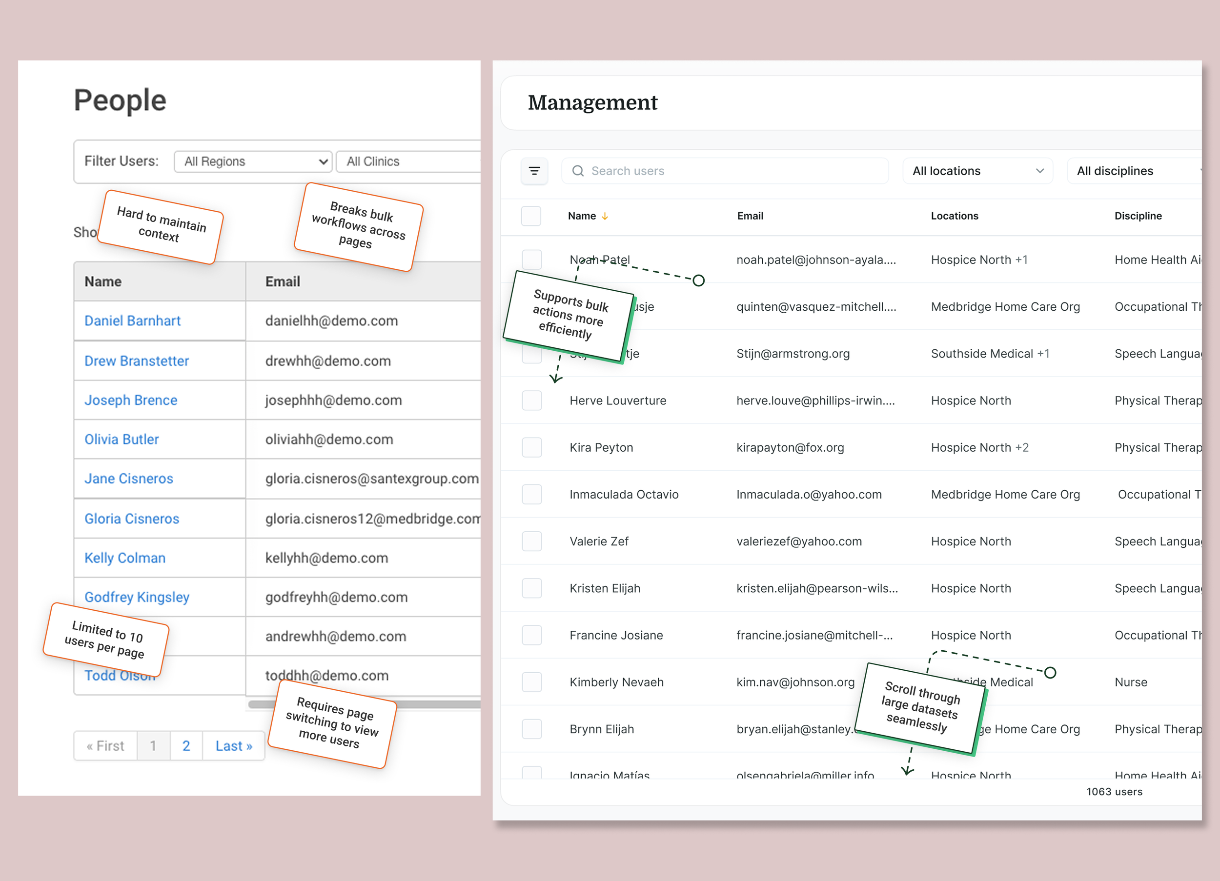
Designed for Scale
Before (Left): Pagination-based experience
After (Right): Visualized continuous list
Decision: Replaced pagination with a virtualized, continuous list to support large-scale admin workflows.
Tradeoff: Removed discrete page boundaries, but significantly improved workflow continuity, visibility, and efficiency at scale.
Established a Single Source of Truth
Decision: Unified user data across systems to eliminate inconsistencies.
Tradeoff: Limited flexibility for edge-case overrides, but improved data integrity, system clarity, and user trust.
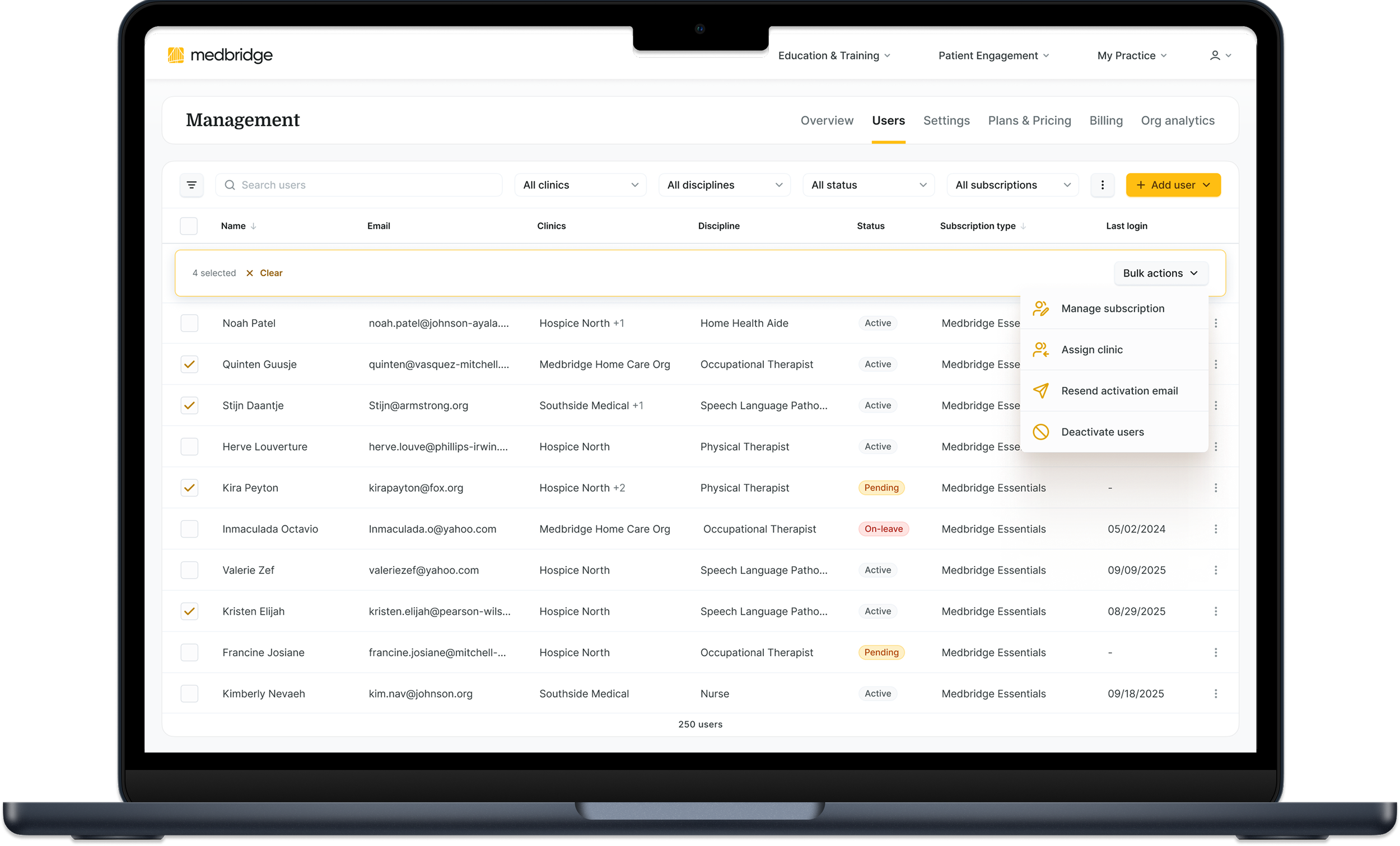
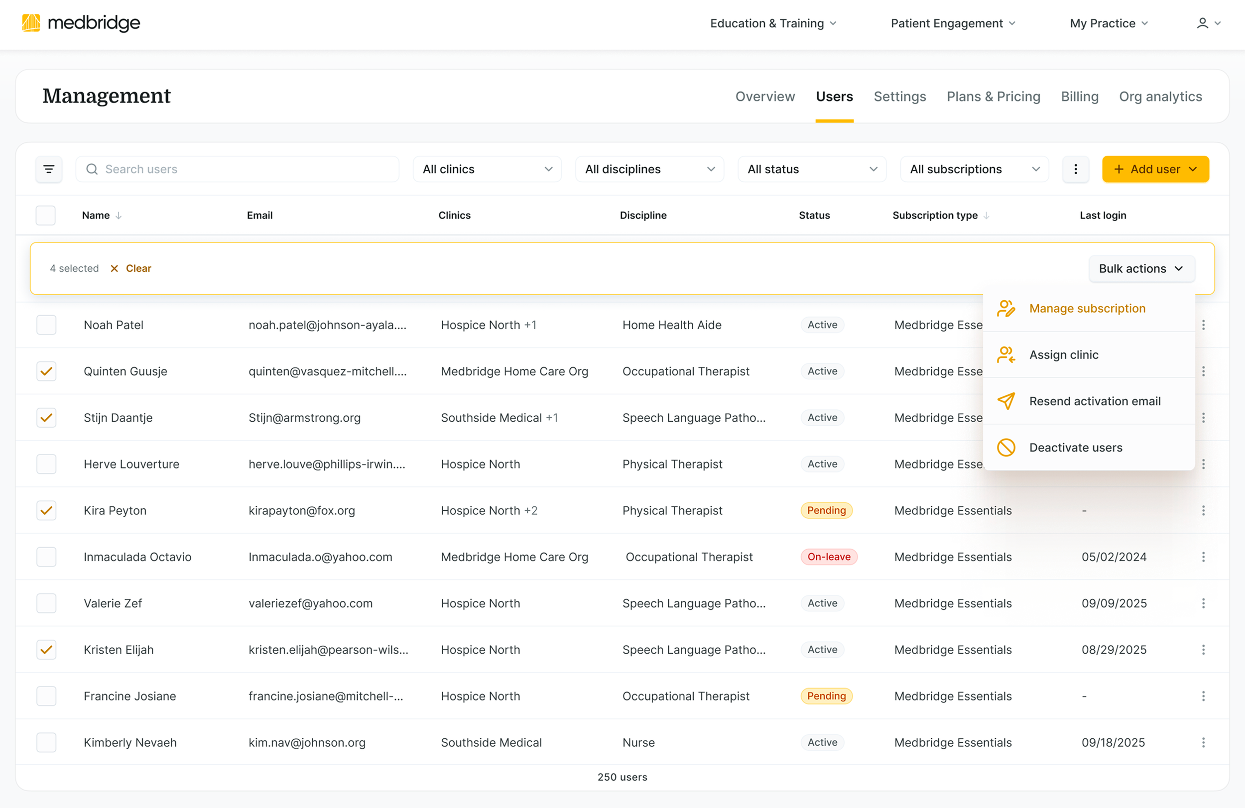
Enabled Bulk Operations
Decision: Shifted from individual edits to scalable batch actions.
Tradeoff: Introduced risk of large-scale errors, mitigated through confirmation patterns, guardrails, and clear system feedback.
Preserved Context During Editing
Before: Full Page Profile (Legacy)
Full page navigation required
Breaks workflow context
Actions separated from user list
Mixed responsibilities
Requires navigating back to continue tasks
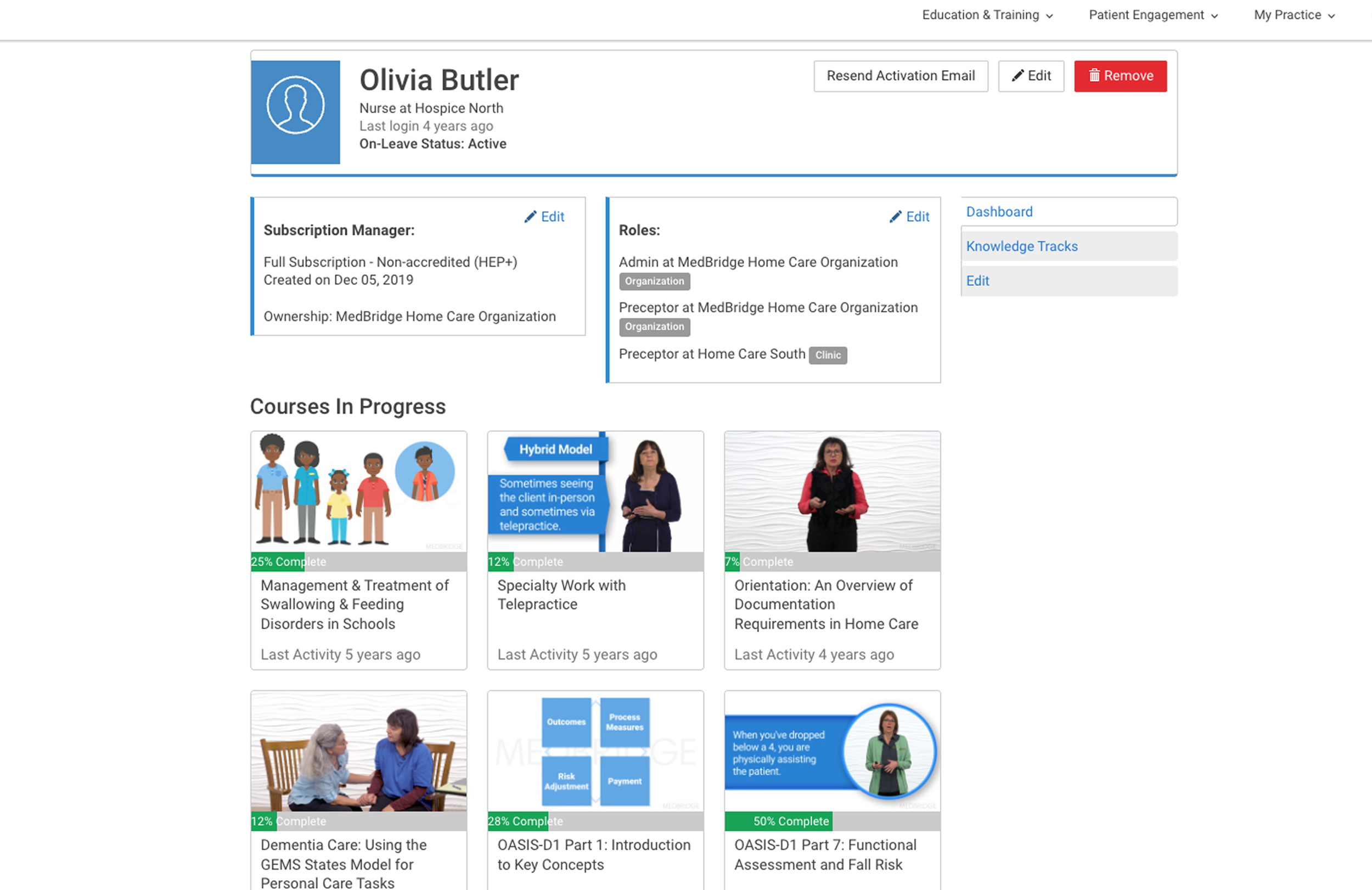
After: Off-Canvas Panel (Redesign)
In-place editing within workflow
User list remains visible
Context preserved during edits
Focused, task-relevant information only
Eliminated unnecessary navigation
Result: clearer mental model, reduced context switching, and more focused workflows
Tradeoff: Reduced full-screen focus, but preserved context, improved visibility, and minimized workflow disruption.
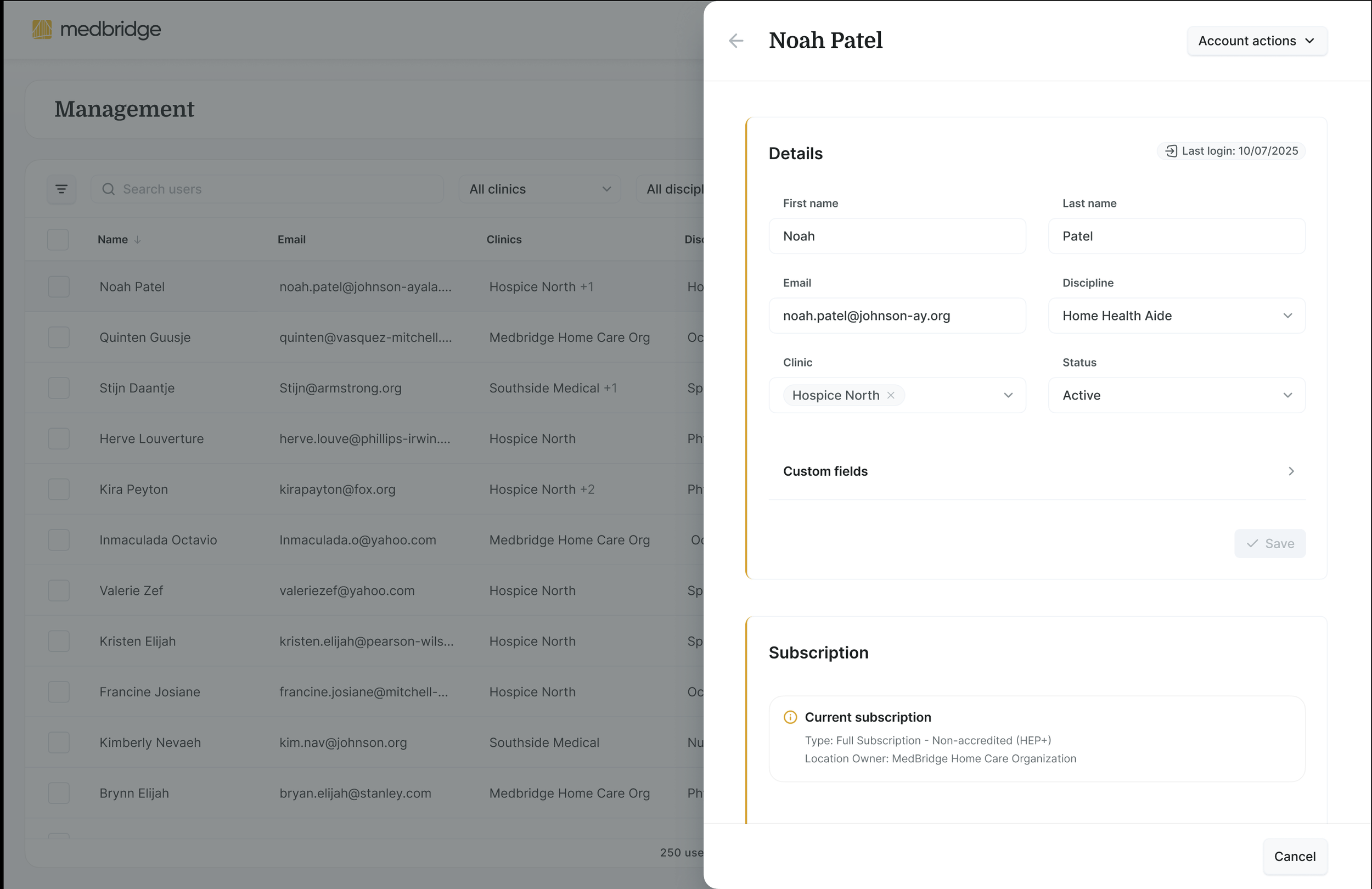
This pattern was designed to scale across other administrative workflows.
Optimized High-Volume Segmentation Workflows
Decision: Redesigned filtering around how admins actually segment and manage users at scale. Introduced multi-select clinic filtering, scalable navigation patterns, and advanced filtering through a reusable off-canvas system.
Why it matters: Enterprise admins spend significant time locating, grouping, and acting on large datasets. Reducing retrieval friction directly improves operational efficiency.
Tradeoff: Increased filtering flexibility introduced more UI density, requiring stronger hierarchy and progressive disclosure patterns.
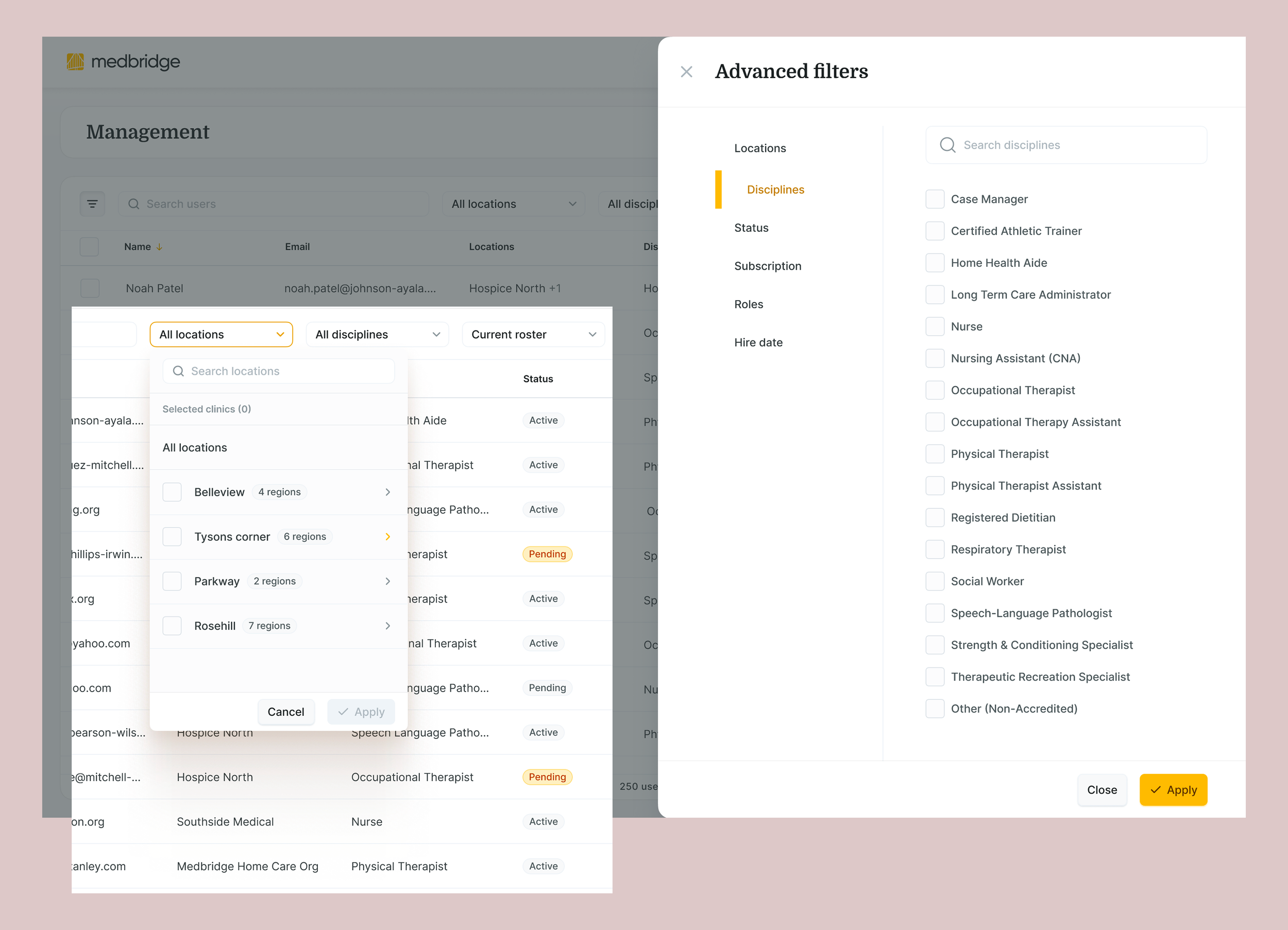
Heatmap analysis revealed filtering was one of the most heavily used but least efficient workflows.
Solution Overview
The final experience brings these decisions together into a more predictable and scalable administrative workflow.
Admins can now:
Navigate within a dedicated Management space
Scan and manage large user sets without performance degradation
Segment users quickly using scalable multi-select filtering
Take action directly within the workflow using bulk operations
Edit user details without losing context
Trust that data is consistent across the system
These changes shift the experience from fragmented and reactive to structured and efficient — enabling admins to operate with greater speed, confidence, and autonomy.
Results
The redesigned system improved clarity, efficiency, and scalability across core administrative workflows.
Operational Efficiency
Early beta testing indicated a ~66% reduction in time required to complete common admin workflows.
Projected ~22% decrease in support tickets related to user management
Usability & Adoption
Reduced clarification behavior during testing
Increased adoption of self-serve workflows, minimizing support dependency
Data Integrity & Trust
Improved consistency of user data across systems by establishing a single source of truth
Increased confidence in reporting and administrative actions
Scalability
Enabled reliable performance for large user sets through virtualization
Established a foundation for scaling administrative workflows as organizations grow

Looking Ahead
This work revealed a strategic opportunity to evolve the platform toward AI-enabled administrative automation.
By integrating HRIS-driven lifecycle management and leveraging engagement data to identify underutilized subscriptions, the system could shift from reactive administration to proactive intelligence.
Design decisions were intentionally made to support this future state.
The goal is to shift from reactive administration to adaptive system intelligence - improving retention, reducing operational overhead, and strengthening visibility across the platform.
Want to discuss the design decisions behind this work?
ℹ️ This case study emphasizes design thinking and decision-making. Details have been intentionally generalized to respect confidentiality and intellectual property agreements.