Bolt App (Formerly Taxify)
Bolt develops and operates the Bolt mobile application, which allows people to request a private driver from their smartphone. As of 2017, the company was experiencing incredibly high volumes of support tickets, stemming from ambiguous factors.
Problem Statement

How might we leverage design principles to address the high volume of incoming support tickets, thereby reducing the burden on support resources and enhancing overall user experience?
ROLE
UX Content and Design Lead
YEAR
2017Responsible for global customer support content and design ownership
Design Process
1. Heuristic Evaluation and Content Analysis
The support screen prominently features a call-to-action (CTA) preceding a list of frequently asked questions (FAQs). This architecture raised concerns as I speculated that certain customers might opt for the button without reviewing the FAQs.
In addition, I reevaluated the tone of voice and devised a content guideline aimed at enhancing scannability, conciseness, and consistency.


2. Competitive Review
After conducting a competitive analysis, some high-level considerations emerged:
Addressing the design dilemma of whether to prioritize the visibility of the contact support button or to display it after users have viewed FAQs.
Incorporating familiar industry terms for FAQ categories.
Exploring the use of illustrated screenshots to clarify certain steps, although this was dismissed due to its labor-intensive nature.
3. Hypothesis
Removing the 'contact support' button from the support page will promote self-service among users, thereby potentially leading to a reduction in the volume of support tickets submitted. enhancing scannability, conciseness, and consistency.
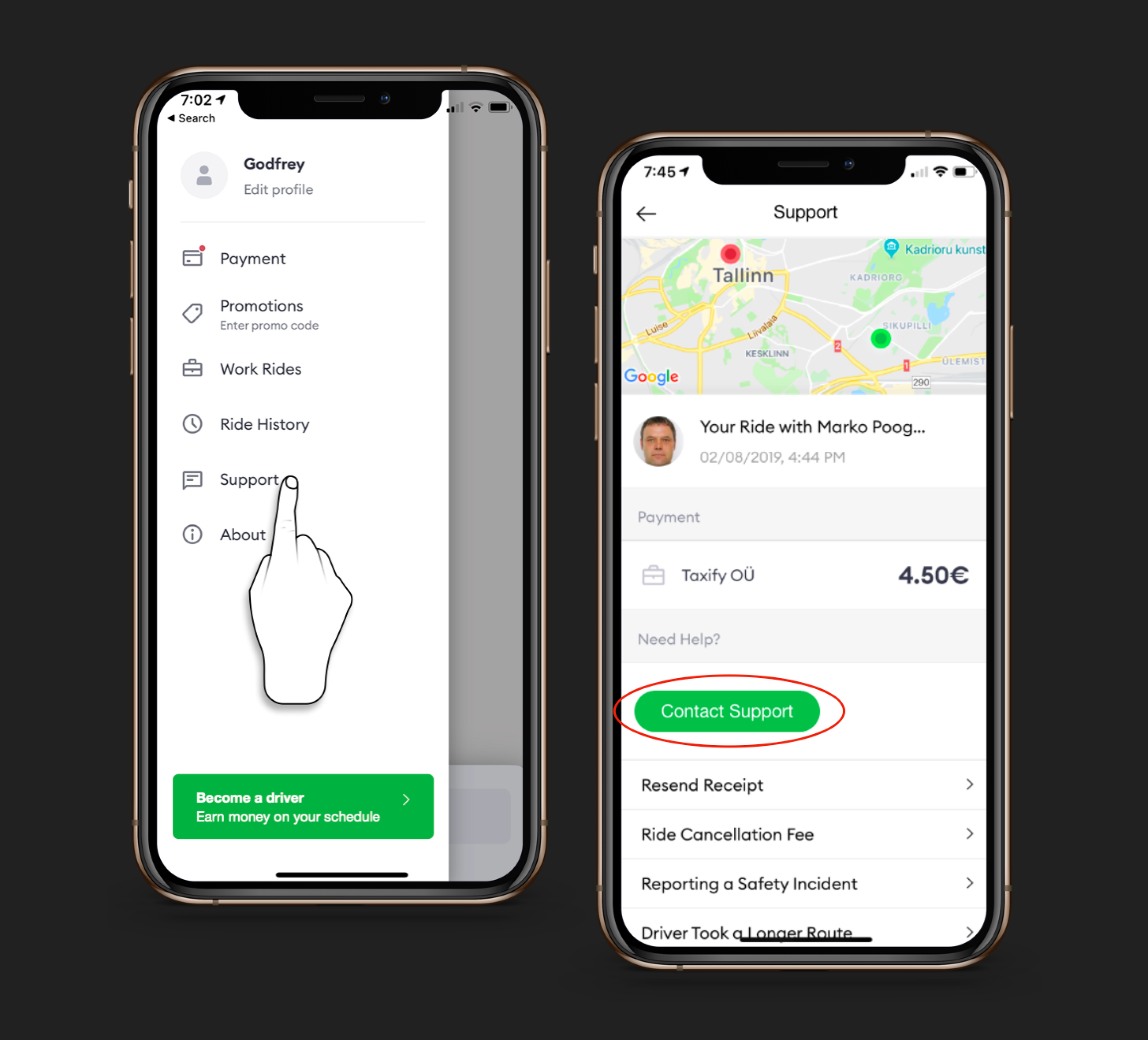
Support screen before redesign
Design
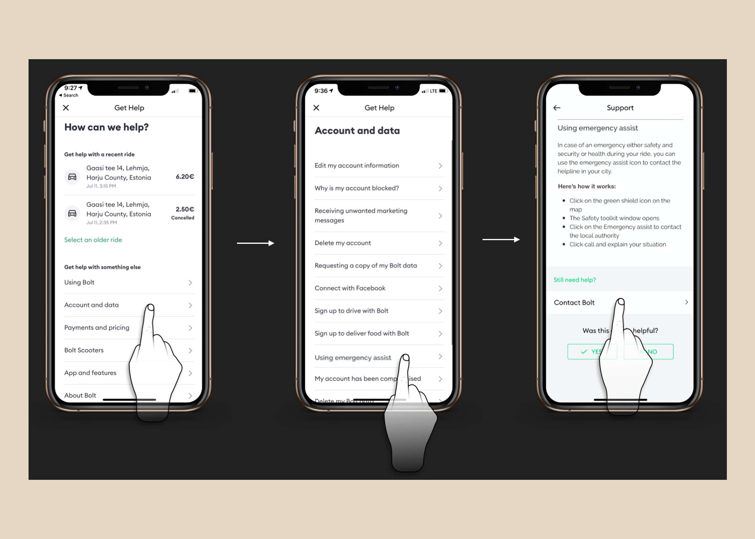
I led a brainstorming session with some mobile stakeholders and developed a prototype that excludes the ‘contact support call-to-action’ (CTA) on the support page to evaluate user experience in comparison to the pre-existing design. Additionally, I overhauled the information architecture, refined content hierarchy, segmented content into distinct categories and sections, all strategically structured to align with data-driven insights.
UX Research and Outcomes
Insights were derived from a study involving 10 users who were tasked with specific actions and encouraged to think out loud. The objective was to analyze user behavior during interactions with the support pages. The sessions utilized live mobile devices to assess completion rates, identify pain points, evaluate content effectiveness, and uncover any overlooked aspects.
Results indicated that users readily comprehended and found the articles pertinent to their requirements. Nonetheless, it was observed that the presence of a conspicuous "contact link" on the page led some participants to bypass reading the FAQ section and opt for the link instead.
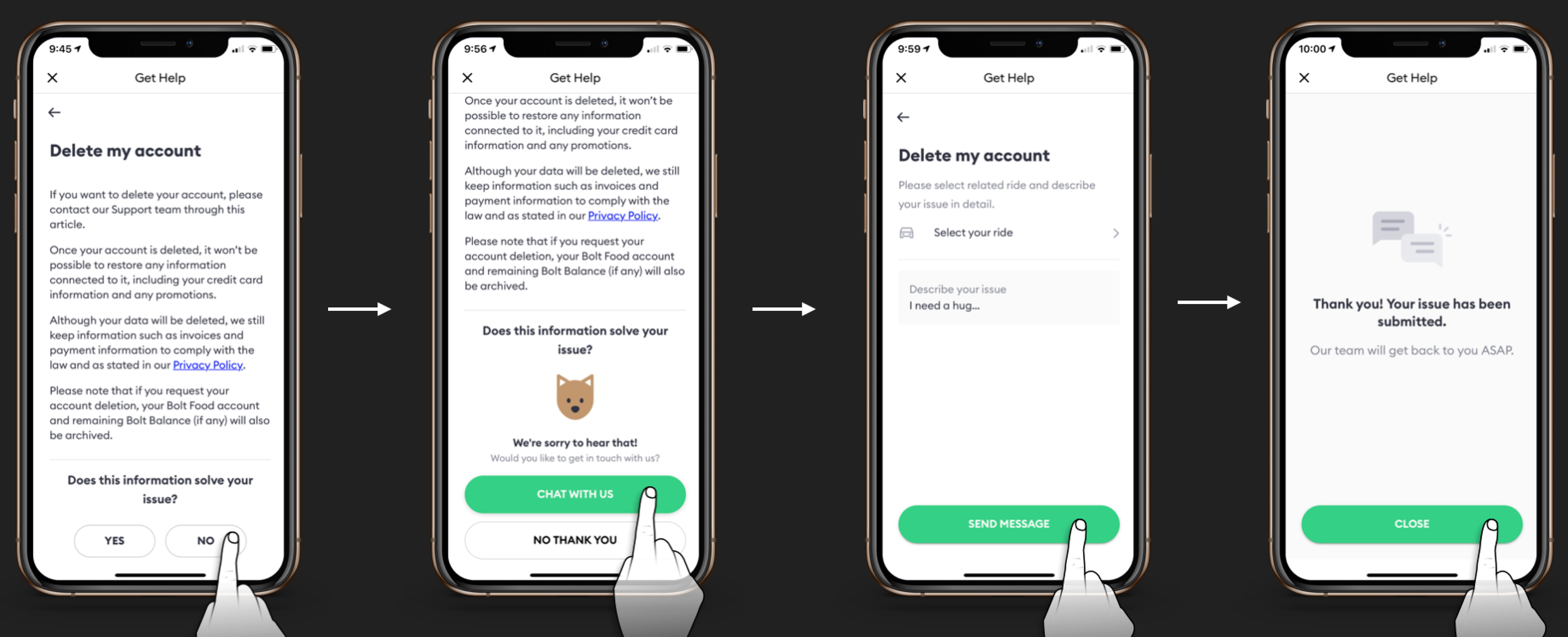
The last iteration using a logic to only allow the "contact option" after a user indicates that the article did not solve their concerns.
Suggestions for Improvement
Relocate the contact support button and promoting self-service through FAQs.
Enhance support articles for brevity and ease of scanning.
Implement a strategy to place the 'contact support button' primarily at the end of content that may not resolve the customer's issue.
Product Release and Results
Following an insightful usability test, the updated version of the support interaction was released to a subset of users for comparison with the previous version, AB testing via Optimizely.
Results:
The redesign, which included an FAQ layer without a prominent contact support CTA and revamped support articles, yielded a significant 22% reduction in customer support Tickets Per Ride.
While some users expressed confusion over how to immediately contact support, overall learnability improved.
During the usability test with actual users, most customers expressed satisfaction with the provided solutions, highlighting a preference over waiting for customer support responses.