
Audi USA Webpage Redesign
I was fortunate to collaborate with Audi - through their digital agency of record (Somo Global) - across multiple work streams, encompassing everything from shopping experiences to purchasing and ownership journeys. Here, I'm excited to spotlight one such project: the Audi Special Offers Redesign.
The Challenge

Audi USA's webpage showcasing offers to customers is experiencing alarmingly low conversion rates, standing at a mere 2%.
Despite hosting a range of compelling deals and promotions, the platform fails to effectively engage and persuade visitors to commit to a purchase or further explore the offerings.
This underwhelming conversion rate poses a significant challenge to Audi USA's digital marketing efforts and necessitates a thorough reassessment of the webpage's design, functionality, and user experience.
Role
UX Designer
Year
2019
My goal was to work collaboratively in designing a top-tier user experience that aligns seamlessly with the brand while offering user-focused solutions to achieve increased conversion rates.
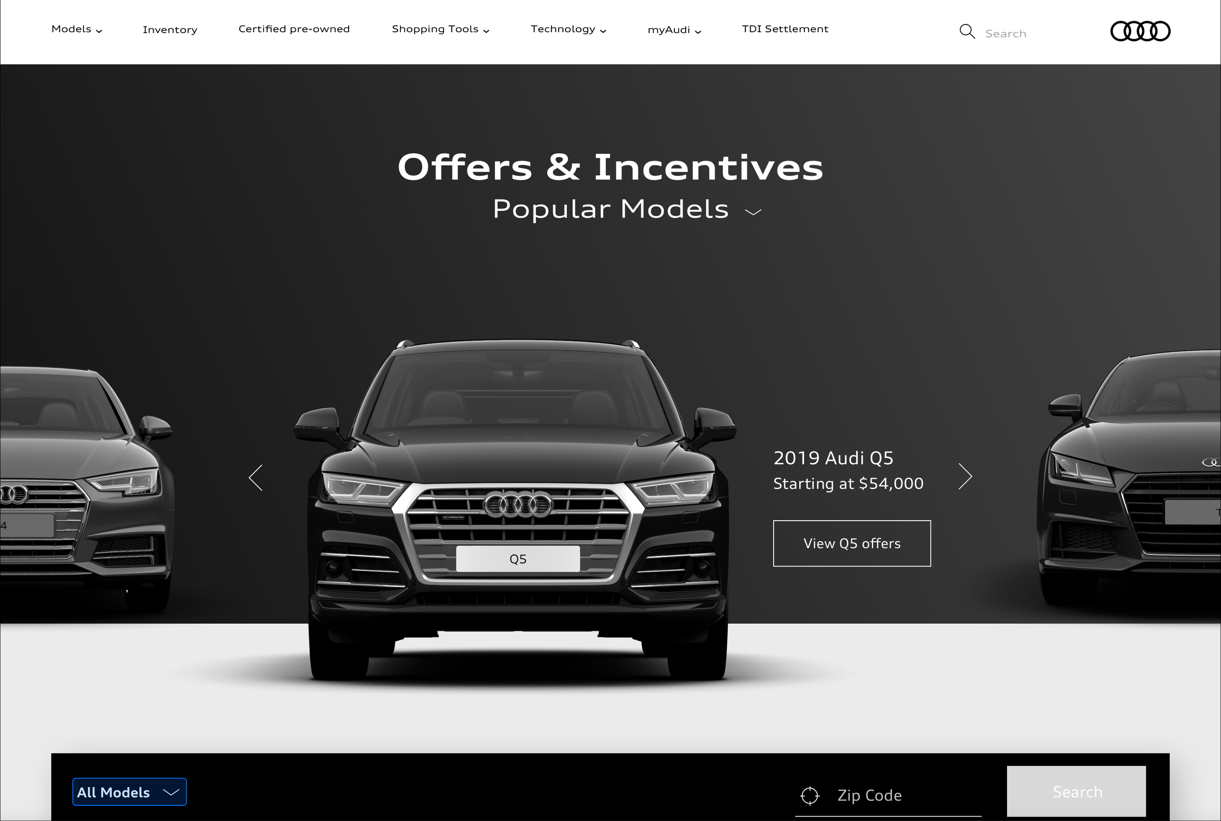
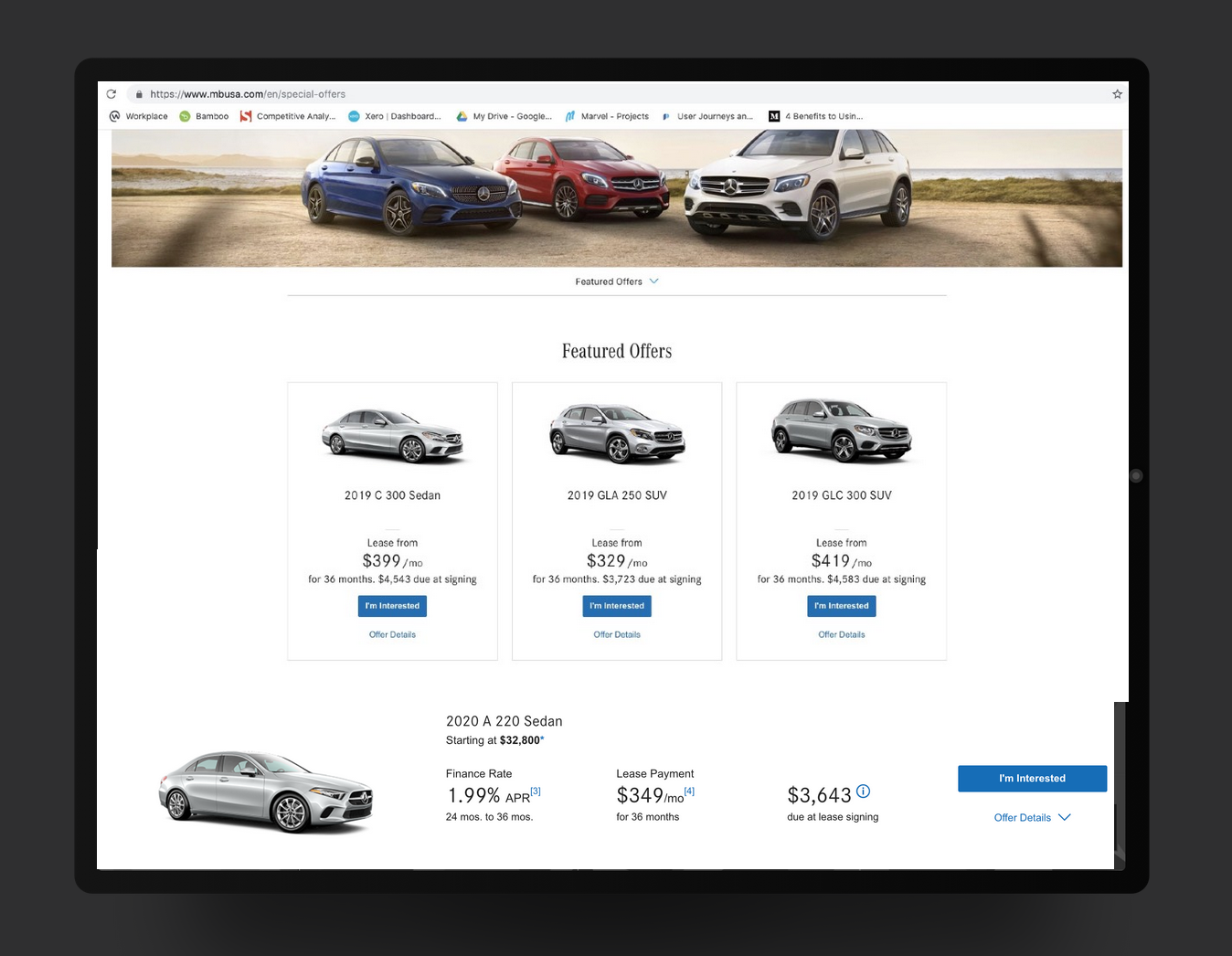
Webpage before redesign
Design Process
1. Evaluative Research
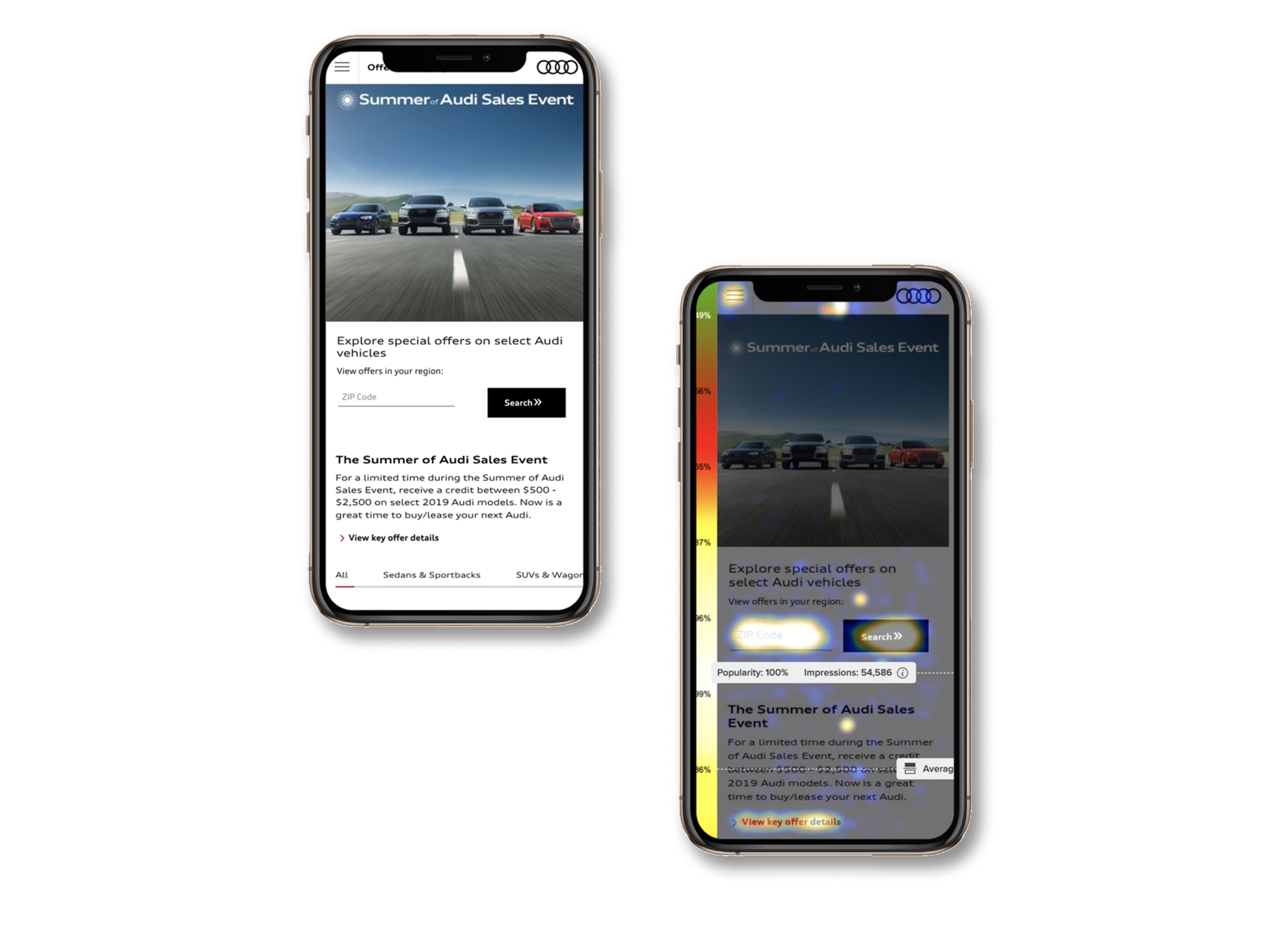
Understanding user behavior was crucial. Working closely with the data team, feedback was systematically collected from heat maps, Adobe Analytics, and prior studies of the current page, highlighting indicators such as bounce rates and usability concerns.
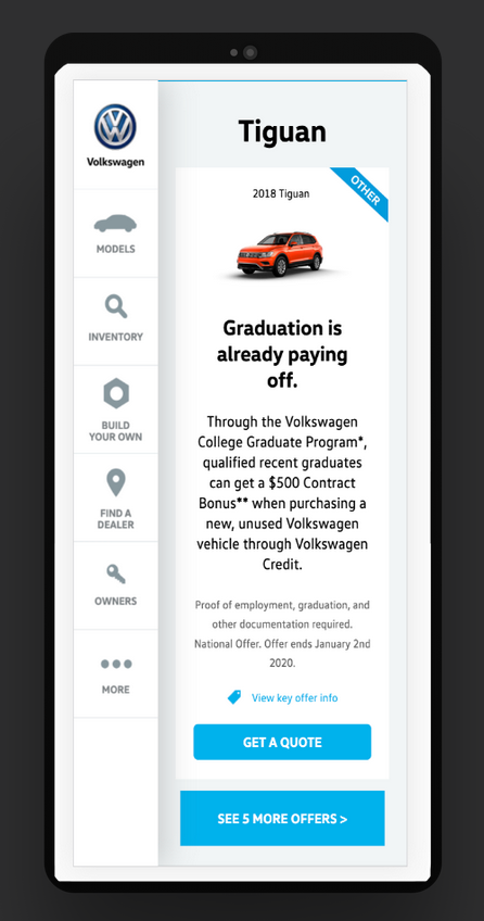
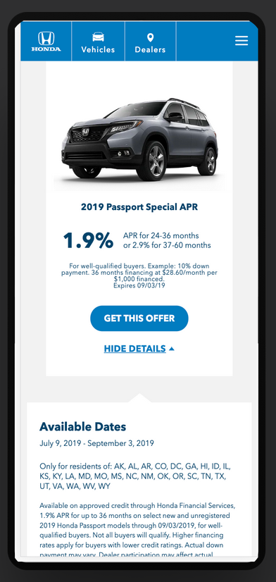
2. Competitive Research
An examination was conducted to analyze special offers and filtering methods both within and outside the industry, aiming to gather insights, generate ideas, and identify potential pitfalls for consideration.
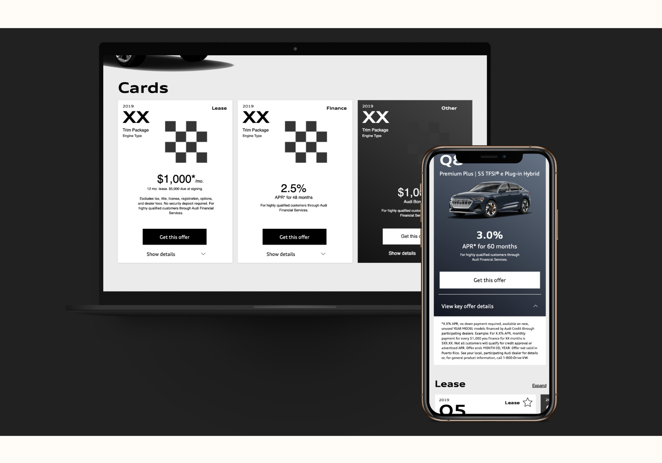
Wireframe
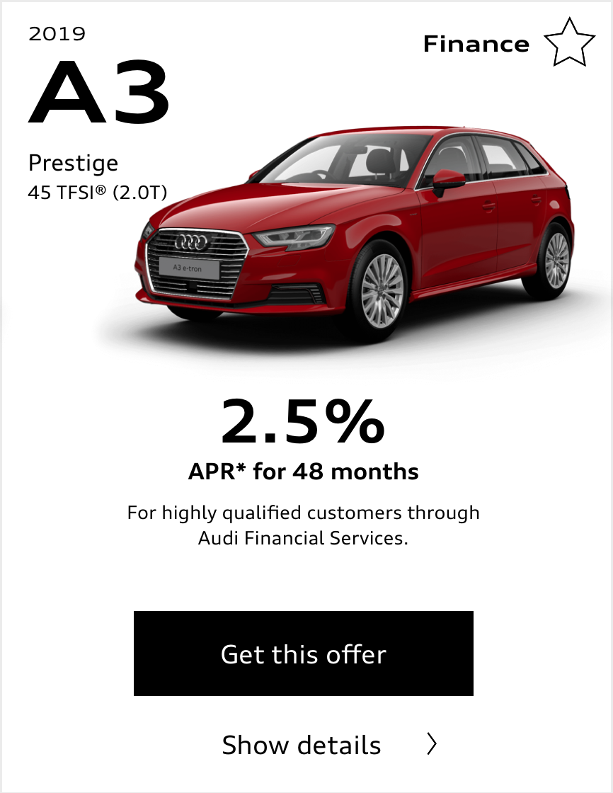
View the prototype used during the testing phase for further context.3. Card Design
Based on insights gleaned from the market review and capitalizing on identified areas of opportunity, the wireframe presented here was crafted to illustrate the card-based concept. Legal disclaimers have been relocated to a collapsible drawer, accessible to users upon clicking the 'view key offer details' drop down, as opposed to cluttering the primary interface.
Video excerpt
4. Remote Usability Test
An evaluation of the special offer categories was conducted to assess their discoverability and efficacy of the layout. The analysis revealed a lack of clarity in distinguishing cash-back offers, among other identified issues.
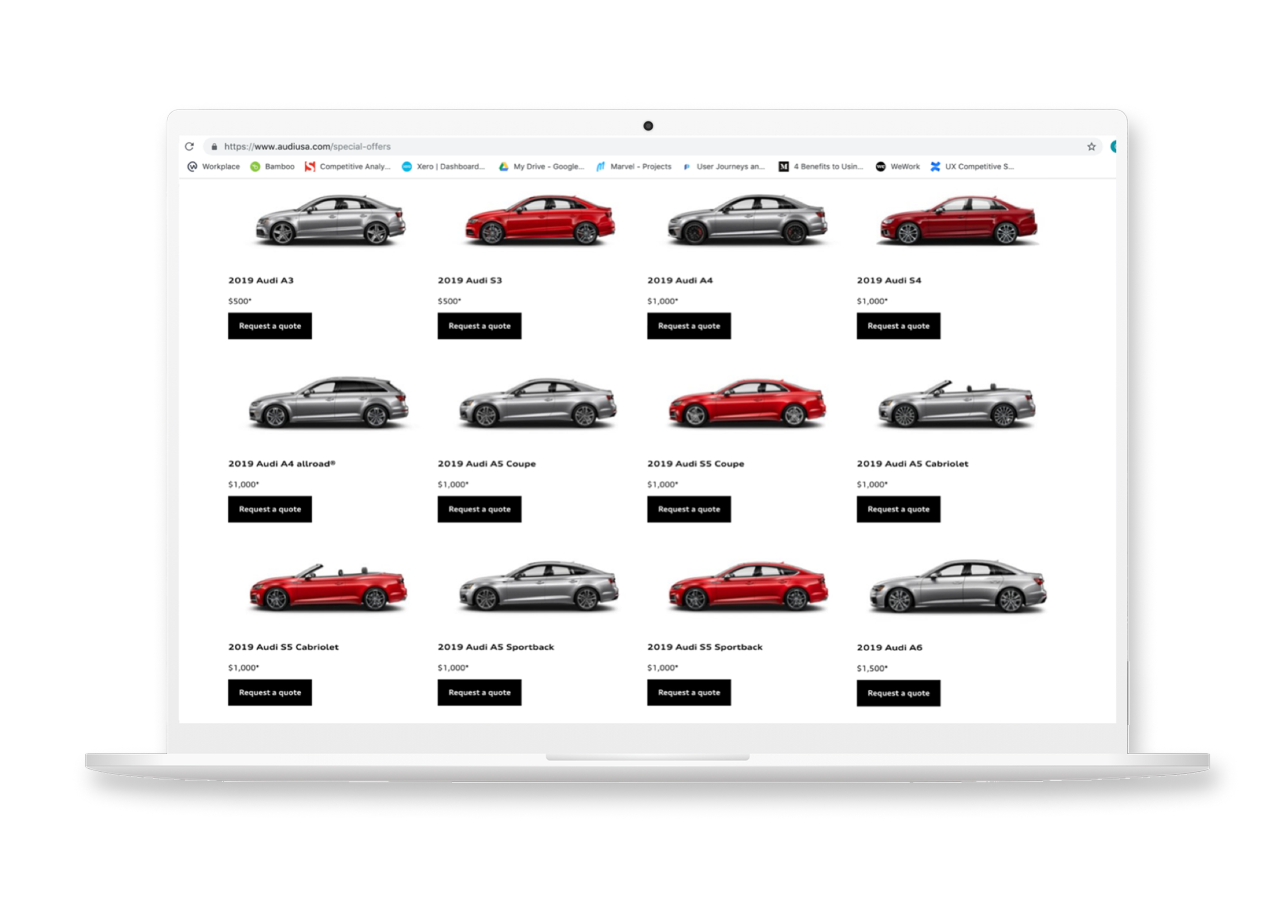
Offers Page Redesign
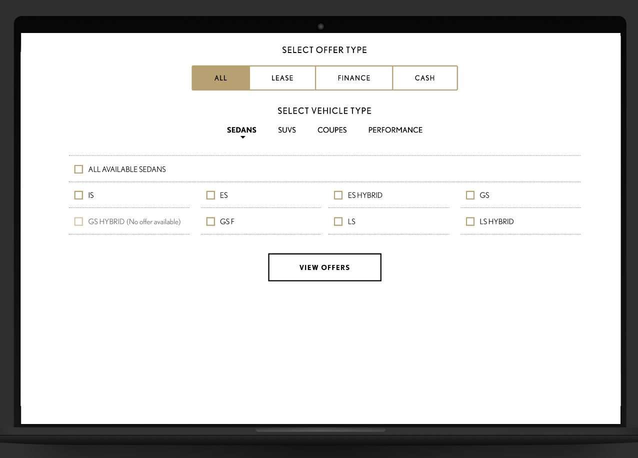
User research uncovered two key issues: the previous design lacked visual appeal, and customers struggled to filter offers effectively.
To address the first challenge, vivid colors were introduced, increasing the overall attractiveness of the interface.
For the second, the filter was redesigned to allow users to easily pair models with offer types, now displaying the number of offers available. In addition, the information architecture was restructured to better align with user needs and priorities, resulting in a more intuitive and engaging experience.
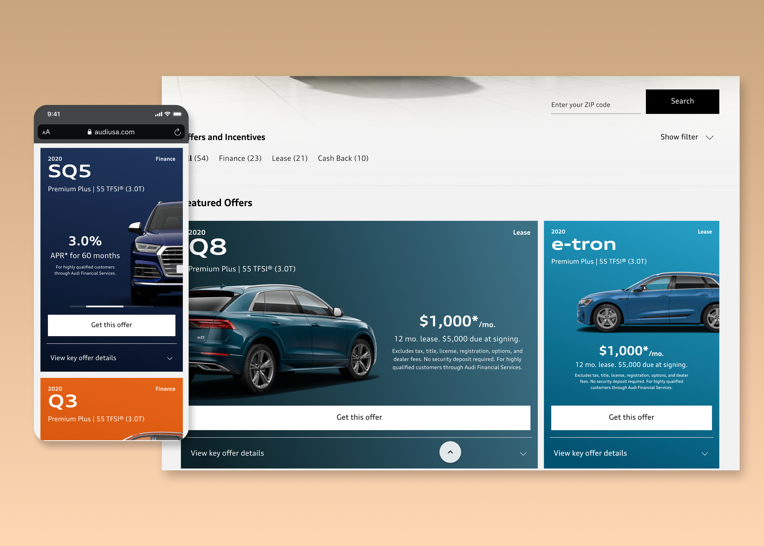
The implemented designs proved effective during the Audi sales event, resulting in a conversion rate of 6%, a significant improvement from the previous rate of 2%, which was below the industry average. While 6% may not appear substantial at first glance, it represents a 60% increase over the automotive industry's typical conversion rate.
Reach out to learn more about this case-study
Business Impact
Showcasing Some Non-related UI and Motion Designs
We've introduced a new scroll-triggered motion component on model landing pages to elevate our brand. Our hypothesis: the subtle motion grabs users' attention and makes longer pages feel shorter. Through this innovation, we aim to create a more engaging browsing experience, redefining user interaction and enhancing our brand's impact.
Interact with the prototypes below: